
Color plays a pivotal role in logo design, influencing perception, emotion, and brand identity. By examining the color choices of iconic brands like McDonald’s, Starbucks, and KFC, we can uncover the strategic thinking behind logo color design and provide actionable insights for creators looking to craft impactful logos.
The Psychology of Color in Logo Design:
Before diving into specific examples, it’s crucial to understand the psychology of color, which helps dictate how certain hues can affect consumer behavior. Colors are not just aesthetic choices; they evoke emotions, convey messages, and play a significant role in brand positioning.
McDonald’s Logo Analysis:
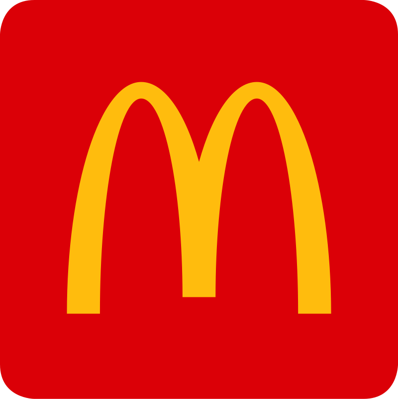
Color Palette: Red and Yellow
• Red: Often associated with excitement, passion, and energy, red is a dominant color in McDonald’s logo, which helps stimulate appetite and draws attention.
• Yellow: This color represents happiness and friendliness, which complements the red to create a welcoming atmosphere. The use of yellow in the large “M” arch is strategically designed to be seen from long distances, enhancing brand visibility.
Impact on Brand Identity:
The combination of red and yellow in McDonald’s logo not only makes it more visible and memorable but also aligns with the brand’s identity of providing quick, enjoyable meals in a friendly environment.
Starbucks Logo Analysis:
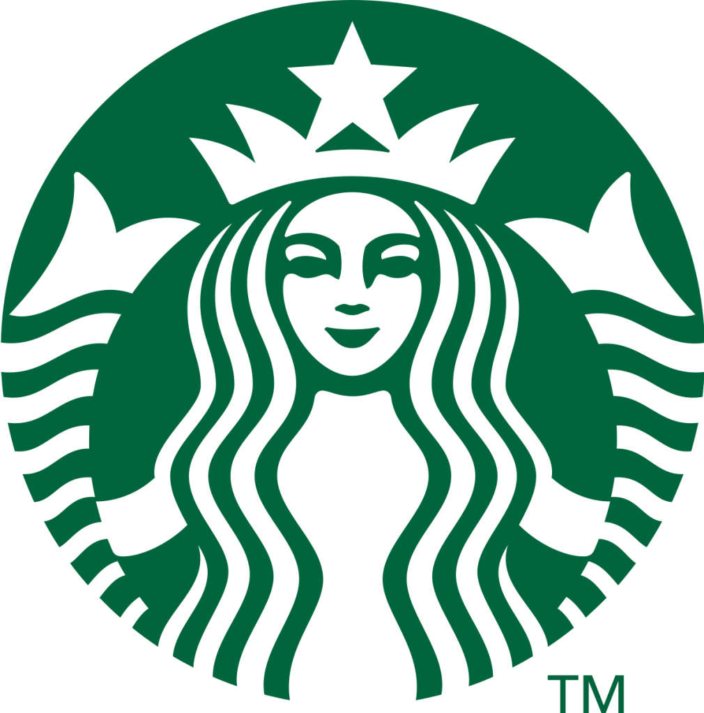
Color Palette: Green and White
• Green: Symbolizing freshness, tranquility, and growth, green is central to Starbucks’ logo, reflecting the company’s commitment to environmental responsibility and quality.
• White: The use of white for the siren in the logo suggests purity and simplicity, which underscores the quality of the coffee.
Impact on Brand Identity:
Starbucks’ use of green not only aligns with its ethical sourcing and sustainability values but also helps distinguish it in the crowded coffee shop market as a premium brand.
KFC Logo Analysis:
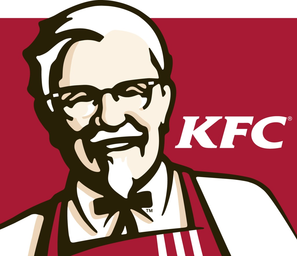
Color Palette: Red, White, and a hint of Black
• Red: Similar to McDonald’s, KFC uses red to invoke hunger and passion but also to stand out against competitors.
• White and Black: The white in the background promotes a sense of simplicity and purity in their food, while black is used sparingly for sophistication and contrast, highlighting the Colonel’s figure.
Impact on Brand Identity:
KFC’s logo effectively communicates the brand’s heritage and authenticity with a color scheme that encourages appetite and conveys energy.
The strategic use of colors in a logo goes beyond aesthetics; it is a powerful tool that can subtly convey a brand’s message and values to its audience. McDonald’s, Starbucks, and KFC each use their color schemes to enhance visual appeal, support their brand positioning, and connect emotionally with consumers.
As a logo creator, consider what emotions and messages you want to evoke through your design. Experiment with different color combinations and consider the psychological impact each hue has. Remember, the right color choice can transform a logo from a simple graphic to a powerful brand symbol.

留下评论